

Hate slogging through pages and pages of weighty books and lengthy work documents? You may not be able to depend on speed-reading apps, but with the right font, you can increase the number of words you scan each second, speeding up your reading pace exponentially.
Familiar Is Best
There's a reason we can't stand emails written in fancy, complicated fonts: they're difficult to read. Though everyone has a favorite typeface, there's one in particular that can help our reading speed improve.
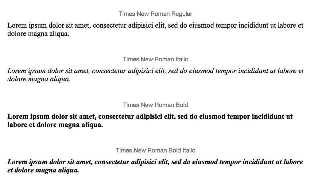
Multiple studies, like the one conducted by Sarah Morrison and Jan Noyes of the University of Bristol, have found that Times New Roman is the best typeface for reading any document. Readers speed through material faster thanks to its simple letters. Whether in print or on your computer screen, Times New Roman fonts are both easy on the eyes and familiar.
Sure, you've seen Times New Roman a million times, in document after document, but why is familiarity connected to speed?
It's All All About the Details
Times New Roman isn't familiar because you've seen it over and over again. In fact, it's because we recognize its letter shapes and associate them with handwritten letters.
Serif fonts, which are defined by Purdue OWL as feet added to a font, are considered by many to be the easiest fonts for us to read. Because they include tails, flourishes, and curves similar to the way we write by hand, they trick us into thinking they're more handwriting than type.

These fonts were created by mimicking ancient manuscripts, according to Sonia Mansfield of Feedgrids. Each tiny swoop upwards on the tail of "t" and the curved and flared bottom of an "s" help our eyes and brains process the words quicker due to their familiarity.
Of course, typefaces that are similar to handwriting can get complicated, as Typotheque explains. Curly, complex typefaces like Curlz don't make us faster readers; rather, they slow us down and inhibit our ability to interpret what we're seeing, which, conversely, can actually help you remember more.
Other Fonts Do Come Close
While other serif and even some sans serif typefaces might seem simple and easy to read as well, research indicates that they take a bit longer to read. Arial, a sans serif typeface nearly as common as Times New Roman, forces us to slow down while reading even though it's a font style our eyes are quite familiar with, according to Mansfield's article mentioned above.
However, there's a great deal of debate over which typeface can take the title of easiest to read. Though research indicates Times New Roman's readability comes from those aforementioned serif qualities, others argue that its fonts are worse for readers who rely on tablets, e-readers, and computers.

And, of course, everyone has their own particular preference for certain fonts—so take advantage of your device's font adjustment settings and choose what's easiest on your eyes if you can't stand Times New Roman.
Stick with What's Familiar
Though Times New Roman isn't the most exciting typeface, there's a reason every one of your teachers encouraged its use for papers and assignments. It's easy on the eyes, and helps us speed through words at a faster rate. Make reading easier on yourself and others: consider sticking to Times when choosing your document fonts.
Just updated your iPhone? You'll find new emoji, enhanced security, podcast transcripts, Apple Cash virtual numbers, and other useful features. There are even new additions hidden within Safari. Find out what's new and changed on your iPhone with the iOS 17.4 update.


Be the First to Comment
Share Your Thoughts